Features
🌟 New landing page
The website got a fresh coat of paint.
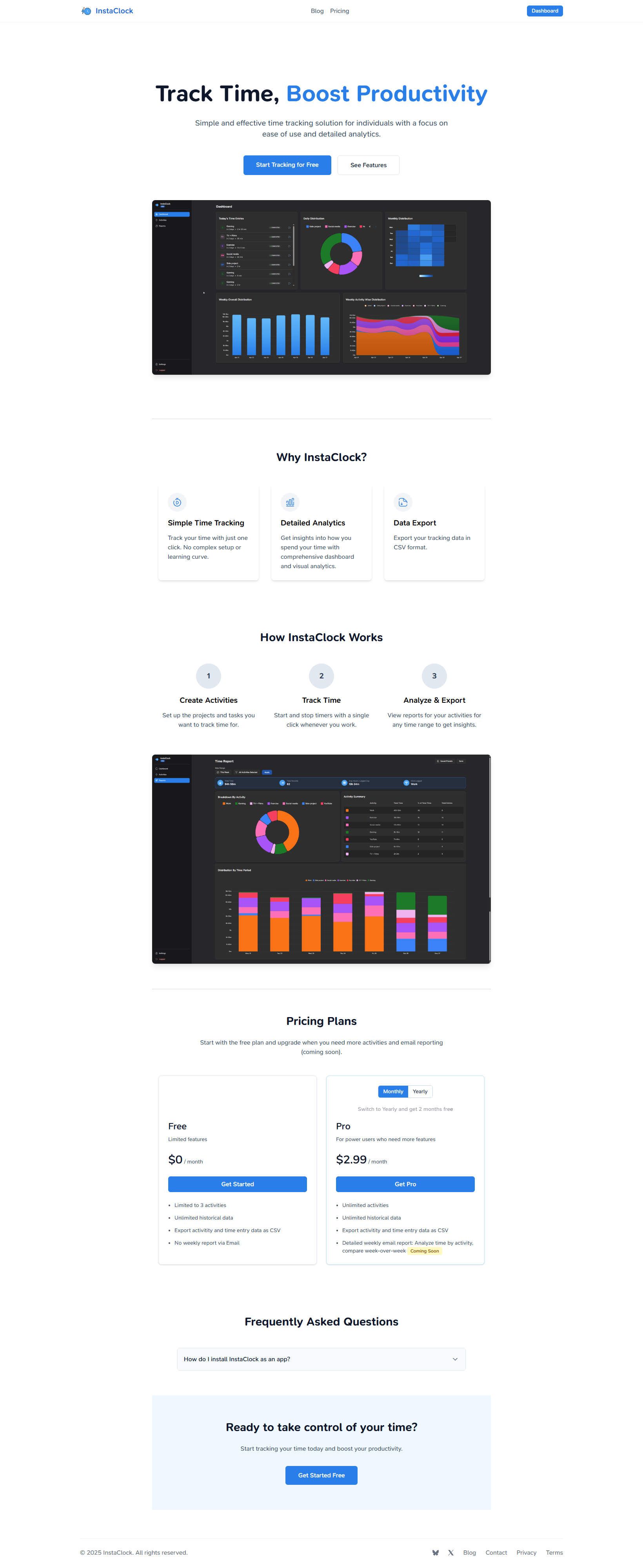
Earlier, the landing page and the blog related pages were quite lacking in design. I went for the “minimalist” look and in the process missed to point out features of the app itself. Below are the changes:
- The landing page shows all the features of the app, with some short videos to show what you get. Earlier, due to the Monthly/Yearly toggle being in the Pro card itself, the Free plan card had some negative space at the top. Moving the toggle outside makes it all more cohesive.
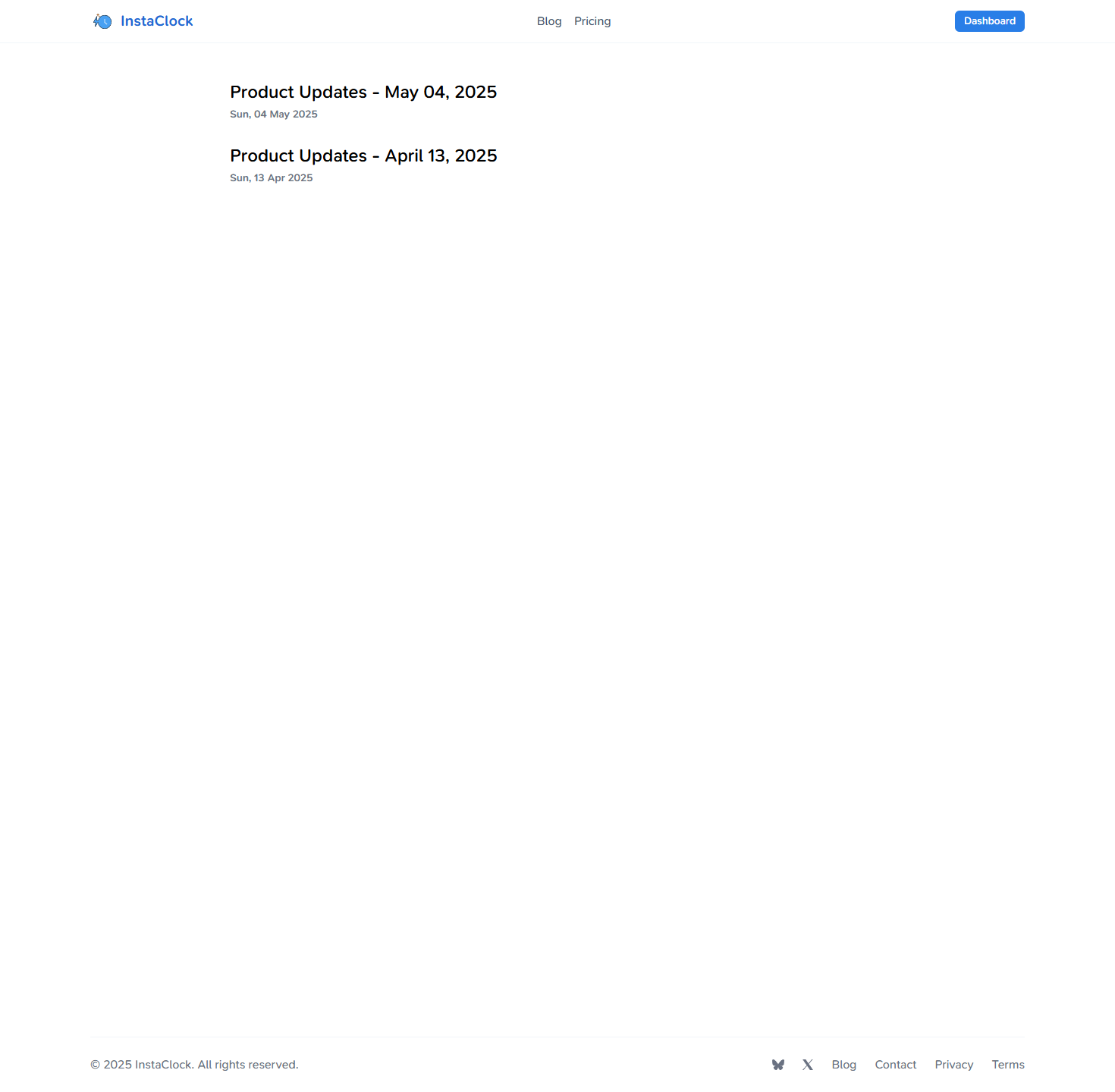
- Blog listing page has a big title with a short description. It also shows lists of posts in a grid of nice cards.
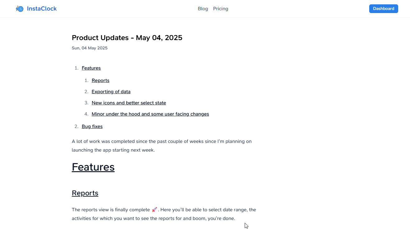
- Individual blog content also has some nice header and footer. The font size overall has been increased with a dash of colour sprinked in.
I have attached the screenshots of the earlier versions for you to check out. Do let me know if you like the changes or not: get in touch

Home page

Blog listing page

Individual blog post
✉️ Email reports
It was a long time coming. Since launching InstaClock, there was always a Coming Soon tag after the email reporting feature in the landing page and in the app. I hated that. As MKBHD says:
Never. Ever. Buy a tech product based on the promise of future software updates.
— Marques Brownlee (@MKBHD) April 18, 2021
So, below you’ll see what you get in the weekly email. In short, you’ll get to see
- Total time tracked in the last week and how it compared to the earlier week in terms of percentage increase or decrease
- Total activities tracked in the last week and how they compare to the earlier week in terms of percentage increase or decrease
- Most tracked activity with the time spent
- Activity wise comparsion with how much time it accounted for the past week along with how it compared to the earlier week in terms of percentage increase or decrease
- Time tracked each day of the week

As of now, I have shipped all the features which I wanted out of a simple, beautiful, easy to use time tracker app. As I continue to use InstaClock myself, I will add new features, and I urge you all to give it a try and let me know your thoughts as well.
Bug fixes
🖼️ Icons not being shown in the forgot password email
If you were to click on the Forgot password button and you were to receive an email, the icons were not being rendered. This has now been fixed.