Features
This is the biggest release since I launched InstaClock. Three things changed at once: the entire app got redesigned, activities are now unlimited for everyone, and the Pro plan has been rebuilt around a single, genuinely useful idea — AI weekly reviews. Let me walk you through each.
🎨 A complete redesign
The app you used last month and the one you’ll open today look like two different products. I rebuilt the interface from the ground up — new typography, a sharper editorial layout, calmer colours, and a lot more breathing room. The marketing site got the same treatment so the two finally feel like they belong together.
The old design wasn’t bad, but it was busy. Charts, banners, and controls were all competing for attention the moment you landed on the dashboard. The new direction is quieter and more deliberate: your numbers come first, everything else gets out of the way.
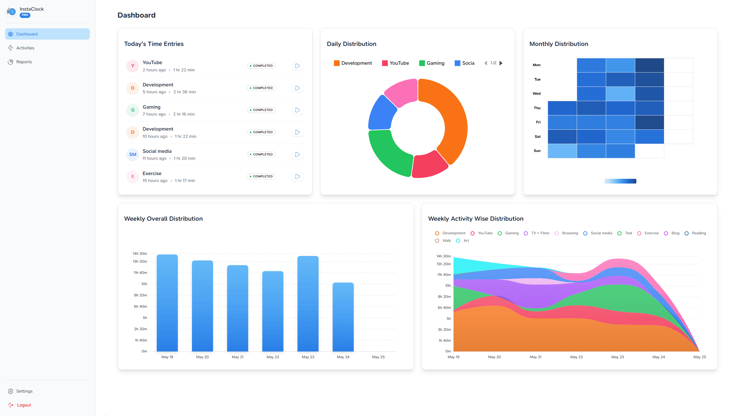
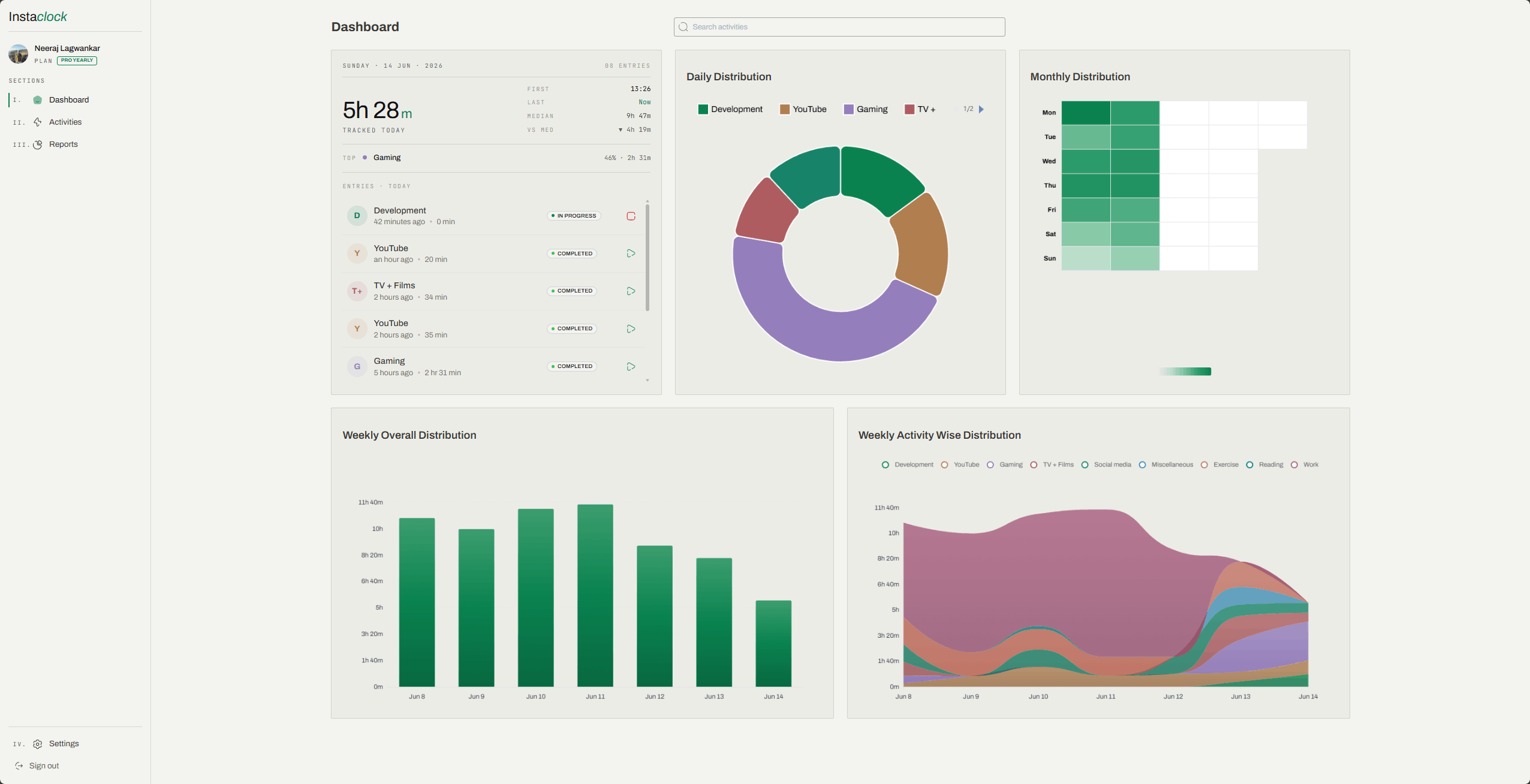
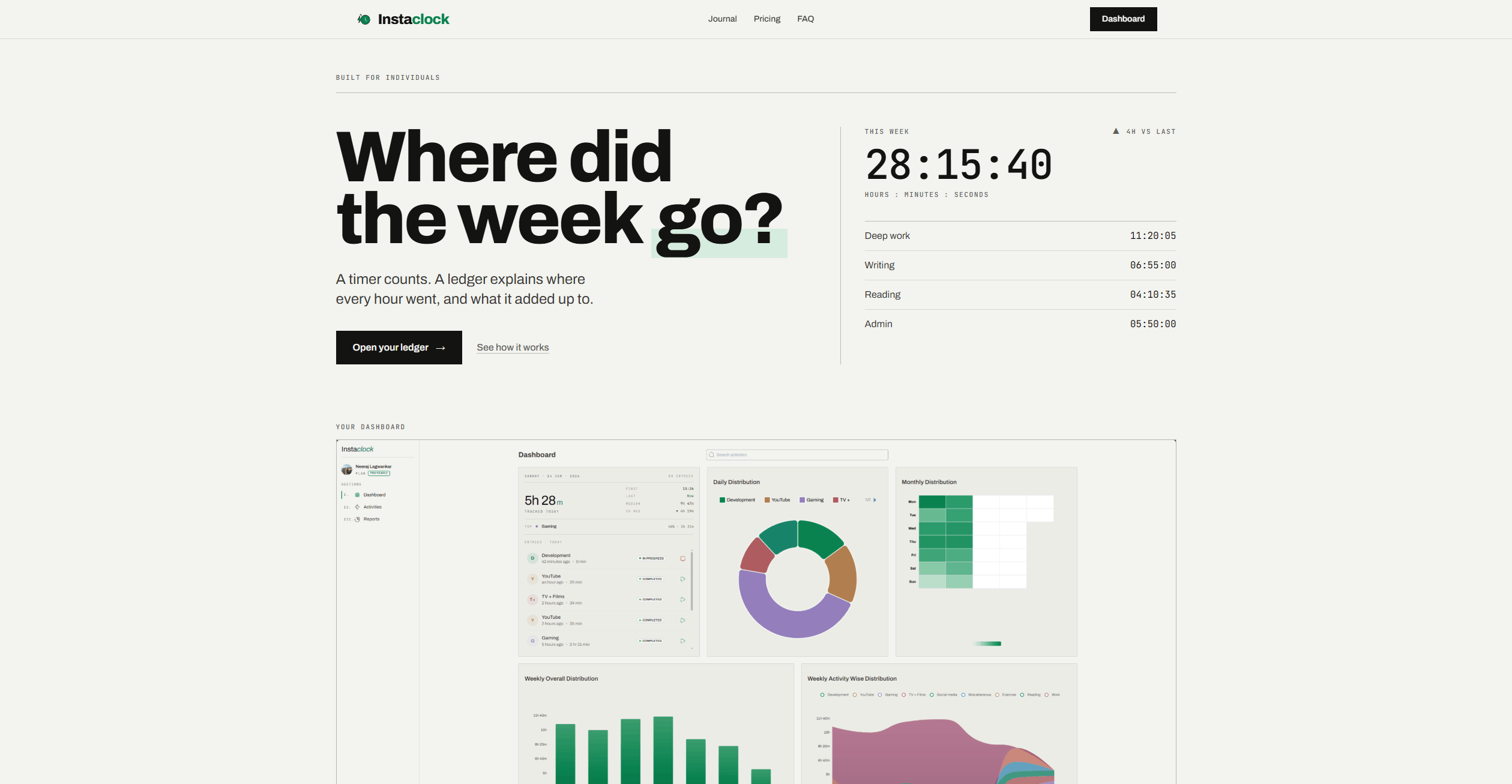
And the landing page — fresh hero, clearer feature sections, and a pricing block that finally matches what the product actually does.
If you have thoughts on the new look — love it, hate it, something feels off — I genuinely want to hear it: get in touch.
♾️ Unlimited activities for everyone
For a long time the Free plan was capped at 3 activities. Honestly, that limit always sat wrong with me. Time tracking only works if you can track all your time, and asking people to ration their activities defeated the entire point of the app.
So the cap is gone. Free is now unlimited.
- Unlimited activities
- Unlimited time tracking
- Unlimited historical data
- Full dashboard analytics, distributions, and custom reports
- CSV export of your activities and entries
No counting, no “you’ve reached your limit” banners, no quietly disabling old activities. Create as many as you need.
If you were affected by the old cap, any activities that got disabled along the way have been reactivated automatically — there’s nothing for you to do.
That’s the release. The redesign was a long time coming, unlimited Free is the right thing to do, and Pro now stands on its own merits. As always, I’ll keep refining — give the new InstaClock a spin and let me know what you think.